The Spot
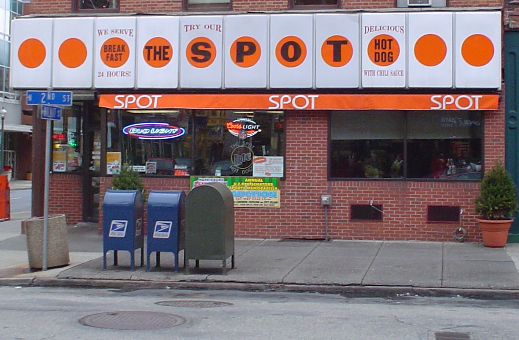
A combination diner/bar in Harrisburg PA, the signage for The Spot mixes an unexpected variety of styles in ways that both clash and create interesting (though presumably unintentional) harmonies.
The upper panel, with its repetition of bright orange dots on a stark white background draws your eye back and forth across the line, dragging them over the letters of the restaurant’s name, each nearly hidden in a separate dot. The characters themselves are a blocky sans-serif with interesting modulations of stroke on the O and the S which seems to bulge in its middle segment. However, against this harsh modern face, set in rows above and below the dots is an ornate serif with an almost victorian sculptedness to the line hight as it literally wraps around its corresponding dot.
Below the main sign is a secondary banner that adds a third style to the mix. Offsetting the dark text on light background above, the name of the restaurant is repeated in a reversed out sans-serif face — but this one highly geometric in style. Aside from the capital T, it’s hard to find a single sharp corner on any of the characters, in marked contrast to the much heavier and more angular sans font above (contrast the sharp point on the P or the squared off edges applied to the S in the upper row).
Berklee
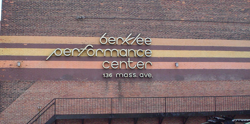
The Berklee Performance Center at the tail end of Back Bay has one of the most 70s-looking graphic identities in Boston. It begins with the earthy color scheme, and reliance upon alternating stripes, but clearly the most striking element here is the typeface itself.
It has a somewhat schizophrenic character: one the one hand the letters without ascenders or descenders are highly geometric, with perfectly circular ‘o’ and ‘e’ characters, and even letters one would expect to be more restrained, such as the ‘r’ or ‘m’ have strong, rounded arcs as their most definitive features. In stark contrast to all this organic roundness are the perfectly straight and sharply inclined ascenders on the ‘b’ and ‘k’, and the boxy parallelogram formed in conjunction with the ‘l’. What makes that ‘kl’ combination stand out all the more is that all of the other letters with straight components also contain a rounded edge, either in the form of a descender, such as the ‘t’, or as a complete circle (the ‘b’ and ‘p’). Whether this makes for an interesting contrast or a jarring break to the flow of the rest of the line is left to the reader...
Cambridgeport Saloon
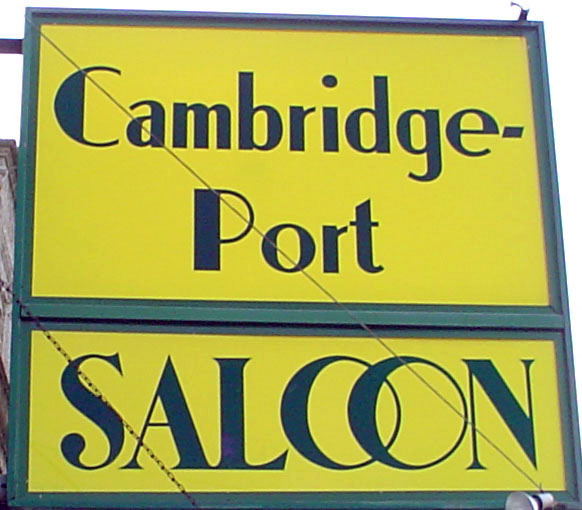
An amazing combination of modernist elements that ends up referencing fonts ranging from Bodoni to Baskerville and yielding a highly incoherent—yet appealing nonetheless—mess, this was found on the front of a dive bar on a dusty stretch of Mass Ave between MIT and the old Necco factory.
Though the bar itself is rather dingy, the sign suggests a degree of elegance: witness the graceful curves and inflections of stroke width on the S in ‘saloon’ and the use of a neoclassical double-O ligature which would be more at home chiseled into marble than painted onto the side of a pub (against a near-fluorescent shade of yellow at that).
Beyond the dissonance between the formality of this text and its physical surroundings, there is stylistic friction even within the context of the sign. While the ‘saloon’ portion of the sign is set in a somewhat ornate serif, the upper pane aspires to a kind of utilitarian, tug-boat chic. The vaguely nautical lowercase characters still have the modernist characteristics of a vertical axis and combination of thick and thin strokes, however the chunkiness of the letters stands in stark contrast to the comparative grace of the caps in ‘saloon’. In addition, the capital C and P in ‘cambridgeport’ are quite different in character from both the caps in the lower pane and the lowercase characters that follow them.
The choice to hyphenate ‘cambridgeport’ is further icing on the cake in this triumph of the vernacular in which countless rules have been broken to create something with a character completely its own.
Bradley Shopping Center

The nameplate for a 50s-era strip mall in the D.C. suburbs, this sign is one of the last vestiges of the city that I remember from my childhood. Like many inner suburbs, Bethesda went through an office tower construction boom during the speculative bubble in the 80s. As a result most of the buildings from earlier in the century were bulldozed to make way for atrocious post-modern mid-rises that would stand vacant for over a decade. In fact even the shopping center at the foot of this sign underwent a less than successful 80s remodeling in which a second ‘Bradley Shopping Center’ sign was added at the other side of the parking lot consisting of those words set, one per line, in (predictably) Helvetica. How they saw fit not to tear down this defiantly retro artifact in the name of Progress is beyond me.
In terms of the type, there’s much to like here, at least in the script portion of the sign. There’s a lovely swash on the capital B and the thin looping strokes connecting the letters in the ‘ley’ section offer a nice contrast to the otherwise unmodulated weight of the letters themselves. It is surprisingly restrained and unornamented for a script face and much of the dynamism it does possess comes from the gently curving baseline forming an asymmetrical arc between the base of the ‘B’ and the descender of the ‘y’. However This simplicity actually interacts well with the decidedly spartan, realist sans that lies below it. Thus it doesn’t need to overdo its frilliness since the contrast will heighten whatever is already there.
Much nicer is the other sans font announcing the parking policy. I particularly like the framing rules above and below the shrunken letters of ‘for’. It’s a charmingly victorian touch to both de-emphasize and decorate such connective words, and seeing it in a utilitarian context like this is pleasingly disorienting.
Friendly Eating

This greek deli on Mass Ave lies between Central and Harvard Squares. Its logo offers an interesting contrast with the script face in the Bradley sign. The most obvious commonality is the curved baseline, though in this case we see not so much an arc as a slightly attenuated upward slope. Again most of the typographical flourishes are devoted to the leading capital character, which somehow still reads as an F despite the fact that the upper arm extends solely to the left—presumably it is still recognizable due to the integral sign-like cross stroke.
A key difference from the Bradley script is the degree of variation in stroke width, giving it a more calligraphic feel, as opposed to the heavy-marker look of the previous sign. On some letters this successfully highlights the more refined touches, such as the rounded terminals on the ‘F’ or the bowl of the ‘e’. However things seem to have gone awry in the dot over the i which has swollen out of proportion and in fact appears to be wider than any stroke in the letters themselves.
Sidewalk (i)
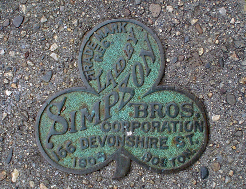
A clover from a residential street between Garden and Huron Ave.
Sidewalk (ii)

A sidewalk medallion from behind the Academy of Arts and Sciences in Cambridge.
Sidewalk (iii)
A sidewalk medallion at the foot of the bridge across the commuter rail tracks below Walden St by Porter Square.
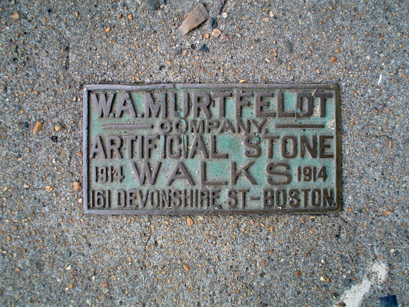
Celco

The nameplate on a seemingly abandoned CELCO substation at the intersection of Hampshire and Broadway.
It’s difficult at first to focus on the text itself since the effect of the selectively-peeling paint is so beautiful. The colors must have been even more striking when the building was initially painted given the contrast between the red walls and the bright green door.
Coloring aside, the letters themselves have more character and idiosyncratic charm than just about anything you’ll find on a storefront today. As a result they are quite difficult to classify. They have a Bodoni-like degree of modulation, as can be seen in the different stem widths in the capital M, however they are much less angular than the typical modern—witness the exaggerated lower bowl of the B and the reversed curve on the leg of the R. Also quite interesting is the asymmetry in the capital C, with a sharp, vertical upper terminal and a much broader, blunted lower terminal which is angled well off to the side.
Best of all are the art nouveau touches seen in the elevated cross bar of the capital E and the gigantic, wedge-like serifs that balloon out of its upper and lower arms. A similar wedge effect can be seen in the capital T whose upper portion appears to have been a rectangle of metal with a semicircle stamped out of its bottom center. The result is a surprisingly successful contrast between the perfectly horizontal top and the graceful curves hanging below it.
Stencil Church
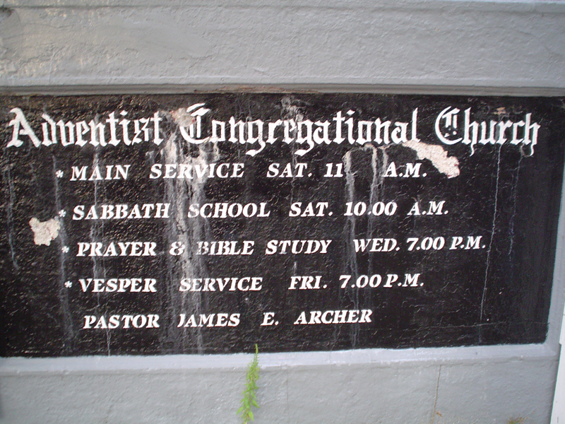
A church on Hampshire Ave between Kendall and Inman Squares.
The contradictions in this sign are staggering on so many levels it’s hard to know where to start. The most dramatic is the idea of using a stencil and spray-paint to render blackletter text. Combining the tools of modern graffiti with letterforms more commonly seen in medieval illuminated manuscripts seems like some kind of PoMo stunt, ‘transgressing’ boundaries between high and low culture. Yet here it is being used for presumably more practical reasons.
An additional ironic twist on this is that using this modern but sloppy inking technique actually produces results in some ways closer to the original than what can be achieved with today’s laser printers. Since the spray paint doesn’t dry instantly it’s given a chance to run and expand the letterforms slightly while it’s still wet, in the same way that ink from a nibbed pen would seep off to the sides slightly as it was absorbed into the paper. Both of these effects lead to a slight irregularity to the edges and variation from instance to instance of a given single character—a form of variation that is all but unseen in these days of offset-printed precision.
The secondary conflict in this sign comes in the informational text below the church’s name. Here the type switches to a more traditional stencil face (so it’s now in harmony with the means of production), but as a result the composition is pairing the sacred blackletter with a rather utilitarian and military-looking bold serif (dissonance returns).
A couple of highlights from the blackletter section: (a) the rather cutely decorative tail on the lowercase ‘h’, and (b) the fact that the stenciling necessitated splitting the s in ‘Adventist’ into two separate (and strangely symmetrical) cells shaped like 7s.
Academy of Arts & Sciences
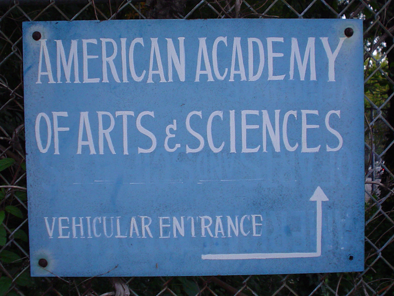
The mysteriously under-defined American Academy of Arts and Sciences on Beacon between Porter and Inman squares. This hand-painted sign has some beautifully restrained and unique letterforms with serifs so subtle as to make classifying it as a non-sans difficult (though in part this may be due to them having been weathered off).
What’s particularly satisfying in this sign is the way that the letterer’s plan for each character develops over subsequent copies. Compare for instance the lower arms of the capital E’s in American, Academy, and Sciences. In the first instance, the terminal is slightly angled to the right but doesn’t seem to project upward at all. By the second E the lower arm swoops up over the entire course of the stroke, but for the final E the stroke now consists of a horizontal section followed by a more abrupt upward curve to a rounded point. By the time s/he reached the ‘vehicular entrance’ text, all bets were off: the E’s now have sharp, inward-turned serifs that nearly touch the cross stroke at the center of the character.
Similar variations can be seen in the A’s. The lead character in ‘American’ has the familiar, modernist contrast of a thin left stem and a thicker one on the right side. Subsequent A’s lose this degree of rigor with more or less uniform widths for each of the strokes. More interesting though is the wildly varying character of the serif at the top of the letter. In the first instance, it is a restrained bracket, by the second A in ‘American’ it has become a wedge serif, and by the A in ‘Arts’ there doesn’t appear to be a serif at all.
In any case, we can be especially appreciative of the artistry in this sign given what seems to have come before. If you look carefully at some of the blue sections, you can see that this sign was actually painted over and re-done. From the look of it, its previous incarnation was far more characterless with mass-produced, blocky sans serif letters that may have done a better job of suggesting the Science portion of the title, but certainly not the Arts.
(A blown-out enlargement of the remnants of the old sign can be seen here)
The Orford
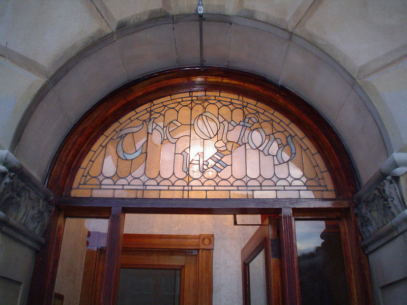
An erstwhile hotel (now apartments) on Oxford street just south of the Somerville/Cambridge border. The typeface in this case isn’t tremendously unique, aside from its being composed of stained glass. The diagonal through the capital O is an unexpected touch giving the otherwise celtic-looking characters a bit of a blackletter feel.
John Murio’s

Murio’s is one of the many bars along Haight Street in San Francisco. Unlike most of the earlier examples, the appeal of this sign doesn’t relate directly to the typefaces used, since neither the blocky, italic sans-serif John or the neon, script-face Murio’s is particularly unique. However, the overall composition is fantastic. The letters in the John line slope off to the right but seem to be doing so in accordance both with the fact that the sign has a rounded corner (cutting off the top-left edge of the rectangle) and the fact that the entire upper portion of the sign is ‘indented’. All this creates quite a bit of rightward movement which is balanced out by a large portion of whitespace along the inner edge of the sign. All of this adds to an interesting justification illusion. The text looks left-aligned since it’s so close to the rounded left edge of the sign, and the white expanse off to the other side, but because of the indentation, John is actually centered with respect to the ‘Murio’s’ line.
The other nice element of the sign is the use of color. The ‘John’ characters rise right out of the red field which serves as a contrasting background for the white script type. By using that field as the baseline, the characters seem to be outgrowths of this large, empty space. More unintentional though is the effect that time and weather has had on the palette of the sign, wearing away the reds and adding an interesting level of shading to the white stripe at the lower left. This has the effect of highlighting the dark outlines surrounding all the characters.
Frank’s
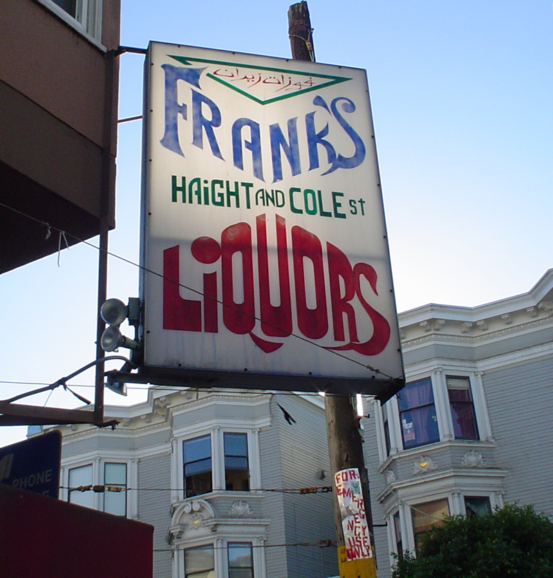
A Haight Street liquor store. This sign is full of weird details that don’t entirely mesh with one another. For one there’s a little indecisiveness over whether the type wants to be a serif or a sans. The ‘F’ and ‘S’ in Frank’s are both fairly classical looking, though the combination of the wedge serifs on the F’s stem and upper arm, but the chunky slab serif on the crossbar is an odd addition. In the case of the S, the graceful curve at the top is offset by what can only be considered a fang sticking out of the bottom. It looks like they also decided to borrow the unconnected capital A from the sans cap font in the second line, making for an awfully strange pairing.
The ‘Liquors’ line seems to be a synthesis of the type styles in the two lines above. Characters like the ‘L’ borrowing the straight blockiness of the ‘Haight & Cole’ line, while the final ‘S’ (with its imitation of what appears to be a swan’s profile) returns to the ornate-yet-fanged style of the top line.
Rexall
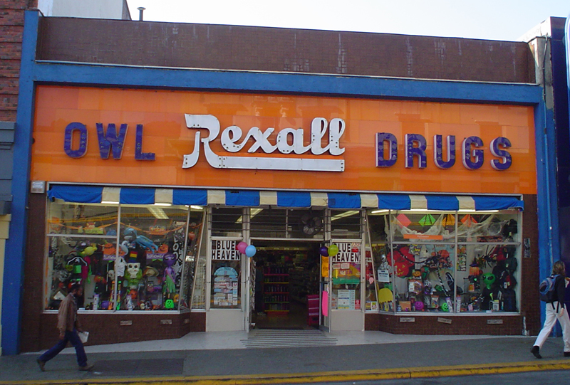
A pharmacy on Telegraph Ave in Berkeley with a fabulous, heavy script face and a saturated orange backdrop combining for a strongly retro feel. It’s always seemed a little ironic for huge, industrially produced signs to be aping the look of cursive handwriting, and I especially like the admission of that friction that you see in this case. For while the script itself tries to look regal and sophisticated, its mass assembled-ness is betrayed by the visible rivets where the slabs of metal were fastened to the front of the building.
Launderland
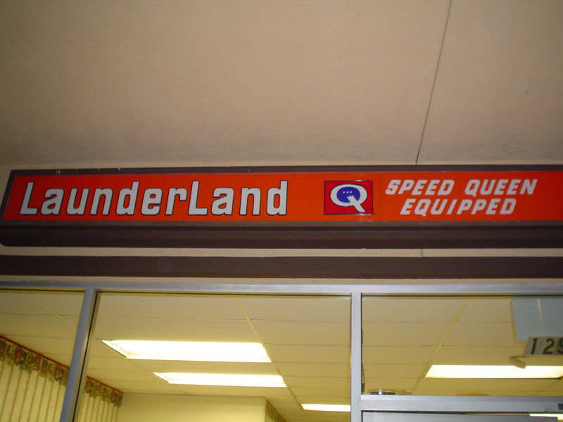
A laundromat in a San Diego suburb. There’s not too much to this sign necessarily. It’s pretty clearly just a stock font on mass-produced, back-lit plastic. But its use here is highly satisfying, and the font itself is interesting. First, it has a truly gigantic x-height—the ascender on the ‘d’ is only half the size even of the counter—and this makes the InterCapping with the two capital L’s become a subtle cue rather than being a distracting and ostentatious dotcom boom-ism. Second, despite being lowercase, the characters are slightly letterspaced, which in this case actually makes the logo more readable. But the reason this is successful (despite breaking Goudy’s sheep-stealing rule) lies in the character of the letterforms themselves. Even though there is no absence of curves in general, their overall footprints are all highly rectangular (e.g., the ‘e’ which is just one big rounded box), so one could argue that these lowercase letters actually have more in common with small caps than the sorts of characters that begin to fall apart in the face of letterspacing.
The Gables

An apartment building in the Knob Hill section of San Francisco. It’s encouraging to see that hand lettering is not dead, and better still to find lettering that looks torn out of an Edward Gorey cartoon. Particularly nice touches include the capital ‘T’ turning into a horizontal rule framing the top of the word ‘the’, the venetian incline on the counter of the lowercase ‘e’, and the exaggerated curve on the ‘S’ in ‘Gables’ which keeps the whitespace in the lower-right corner from overpowering the composition.
Sidewalk (iv)
In front of a house on Cottage Ave west of Porter Square.
Dole Publishing

A strange mixture of blackletter and contemporary type on the front of this defunct publishing house at the beginning of Summer Street in Davis Square. There’s something kind of charming about putting a ridiculously ornate capital on the front of a word set in univers—perhaps the most characterless of Frutiger’s sans-serifs. However, unless they were trying to make some sort of statement about their own modernity combined with traditionalism, I’m confused as to why a publishing company would settle for such a questionable design choice in their identity...
Submarines
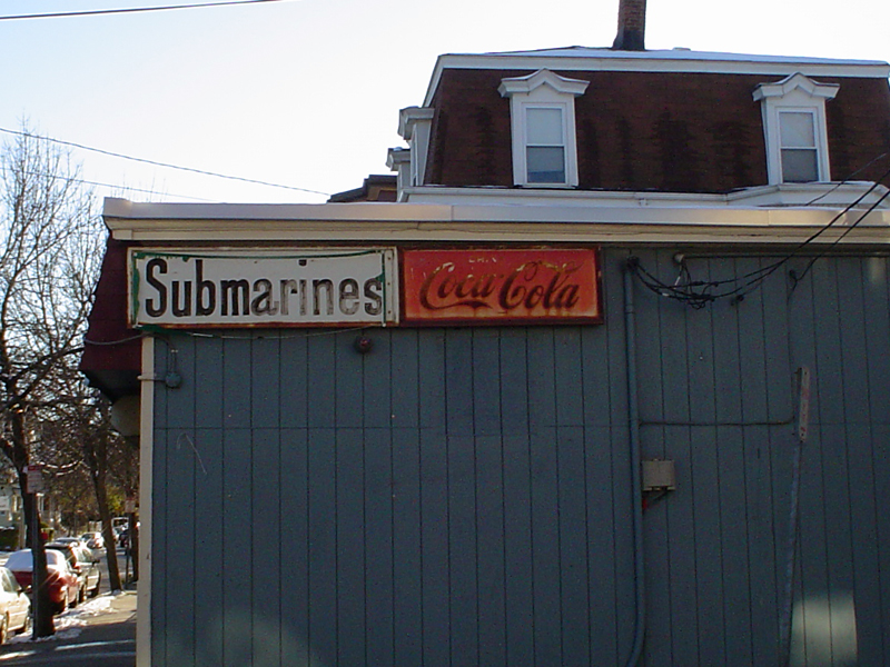
A sign announcing some of the offerings of the Y-Not Variety market on Willow Ave connecting Davis and Ball Squares. Clearly this one caught my eye more due to the decay aspect than the typeface itself. The pairing of the splotchily-fading black text in ‘submarines’ with the beautiful rusty sunset colors of the coke logo certainly adds something as well. Nonetheless, there are a few neat details in the ‘submarines’ lettering. It has a greater roundedness than what you’d expect in a typical grotesk: note the nicely caligraphic, stacked ‘a’ character and long finial on the ‘r’. But to this it adds strangely sharp, angular touches such as the 45° turns in the middle of the capital ‘S’ and hard edges on the left of the ‘b’.
DeLux
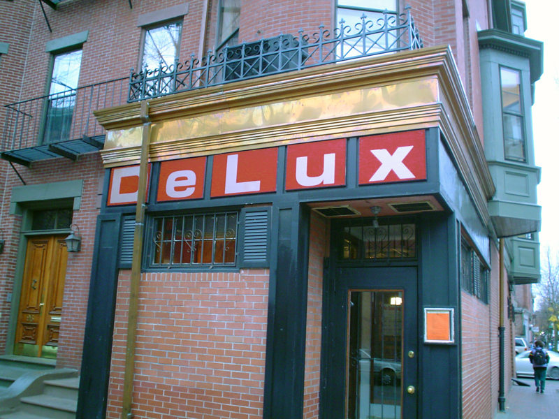
A tiny restaurant in the south end. After waiting an hour for a table there once, only to be informed that they were out of the ingredients for about 50% of the menu.... All the same, the place’s identity is quite striking in the context of a neighborhood which maintains a painfully tasteful and traditional (though admittedly beautiful) Boston aesthetic of brick, bay windows, and colonial ironwork. As a result the white-on-red characters of the DeLux sign positively scream, despite the fact that they would be virtually invisible were the storefront on Mass Ave or Commonwealth.
I particularly like the contrast of the red squares against the dark green paint of the door and shutters. Within the cells of the sign itself the white of the characters stands out quite starkly, but the effect is considerably more calming than it would be were the red and white reversed. Also perfectly chosen for playing up the disconnect between the restaurant’s graphic identity and that of the surrounding neighborhood is the typeface—a mid-century modernist sans serif. It is overwhelmingly unadorned and makes for yet another interesting contrast between its own minimalism and the comparatively ornamented entrances and walkways nearby. The one interesting feature of the font itself is the ‘e’ character whose outline is almost perfectly rounded as it turns in upon itself.
Teddy Shoe
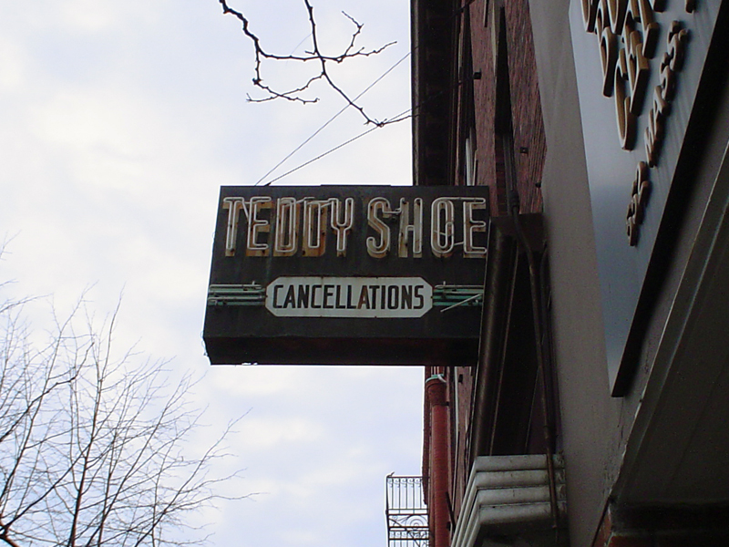
A shoe store on Mass Ave in Central Square. The appeal here is somewhat similar to the John Murio’s sign: an already retro design made even older-looking and more colorful by the askew and blasted state of its neon tubes. The design is completely defined by its hard angles—every character is a block. The ‘oval’ around ‘cancellations’ is really an octagon, and even that is bordered by Deco-style horizontal rules. (For the record, I’m still a little confused as to how a shoe gets ‘cancelled’...)
Kaplan Furniture
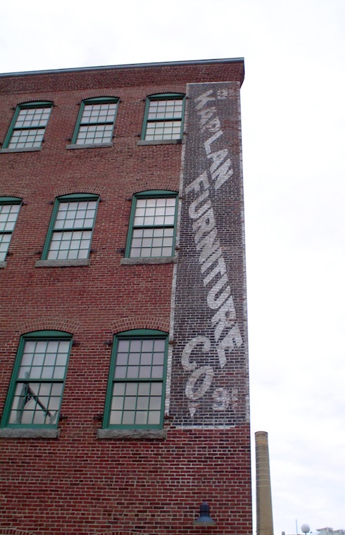
A mill-style building off Mass Ave in the area between Central and Kendall where MIT stops and the warehouse district begins. They clearly had a major design problem to solve given the length of the company name and the narrowness of the paintable-space on the side of the building (only this corner is visible to passers-by on Mass Ave). Whether their approach was entirely ‘successful’ is left as an exercise to the reader. The extremely slanted baselines coupled with a reverse-oblique axis on the characters themselves makes the sign legible even without cocking your head, but it also makes the composition feel highly unstable—as though the words would fall right off to the left if not for the white border holding everything together.
The touch I appreciate the most though is the inclusion of the street address in the top and bottom corners. The 9 numeral along with an adorably literal arrow pointing to the doorway make the sign do double-duty for both advertising and mail delivery purposes. Now that’s economy of design...
In late 2004 I started a two-week photo project in connection with a typography class I was taking in the evenings.
After years of walking around Cambridge and Somerville and gawking at the beautiful typography on aging storefronts, I set out to catalog and classify some of my favorites (and try out some of the new type jargon I’d been accumulating).
From there things snowballed and the search for fading signage became my standard way of getting to know new cities. What follows is the first six years of this ongoing obsession.